网页弹性按钮(纯css3) by zhou
Sun, Oct 25, 2015网页中弹性按钮设计(纯CSS)
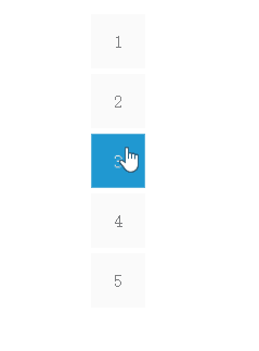
效果如下:
思路
其中包含2个动效,第一个是按钮中心的颜色扩散,第二个是按钮弹性收缩。
- 第一个颜色扩散:按钮分为了两层,第一层是按钮本身,第二层是按钮的为元素:before,注意按钮before是这个效果的重点,通过hover动作触发按钮before层的扩散。
- 第二个弹性收缩:需要使用@keyframes设计动画的效果。
两个动画独立完成后,重叠在一起的话,需要调整动画的时间及效果。
代码分析
html
<div class="bottle">
  <a class="hvr-rectangle-out hvr-pop" href="javascript:void(0)">1</a>
</div>
  <div class="bottle">
  <a class="hvr-rectangle-out hvr-pop" href="javascript:void(0)">2</a>
</div>
  <div class="bottle">
  <a class="hvr-rectangle-out hvr-pop" href="javascript:void(0)">3</a>
</div>
  <div class="bottle">
  <a class="hvr-rectangle-out hvr-pop" href="javascript:void(0)">4</a>
</div>
  <div class="bottle">
  <a class="hvr-rectangle-out hvr-pop" href="javascript:void(0)">5</a>
</div>
css
/*按钮基础样式*/
.bottle {
  display: block;
  width: 50px;
  height: 50px;
  margin-bottom: 5px;
}
.bottle a {
  text-decoration: none;
  color: gray;
}
/*颜色扩散动效部分*/
.hvr-rectangle-out {
  display: inline-block;
  vertical-align: middle;
  transform: translateZ(0);
  box-shadow: 0 0 1px rgba(0, 0, 0, 0);
  backface-visibility: hidden;
  position: relative;
  background-color: #fafafa;
  transition-property: color;
  transition-duration: 0.3s;
}
/*:before这个是颜色扩散动效的重点*/
.hvr-rectangle-out:before {
  content: "";
  position: absolute;
  z-index: -1;
  top: 0;
  left: 0;
  right: 0;
  bottom: 0;
  transform: scale(0.5);
  transition-property: transform;
  transition-duration: 0.2s;
  transition-timing-function: ease-out;
}
.hvr-rectangle-out:hover,
.hvr-rectangle-out:focus,
.hvr-rectangle-out:active {
  color: white; /*颜色扩散时候,字体改变颜色*/
}
.hvr-rectangle-out:hover:before,
.hvr-rectangle-out:focus:before,
.hvr-rectangle-out:active:before {
  background: #2098d1;
  transform: scale(1); /*hover触发:before层的扩散*/
}

/*弹性收缩动效部分*/
/*使用keyframes定义弹性动画
  1是原来的比例扩散到1.05倍的比例,再缩回1倍原来的比例*/
@keyframes hvr-pop {
  25% {
    -webkit-transform: scale(1);
    transform: scale(1);
  }
  50% {
    -webkit-transform: scale(1);
    transform: scale(1);
  }
  75% {
    -webkit-transform: scale(1.05);
    transform: scale(1.05);
  }
  100% {
    -webkit-transform: scale(1);
    transform: scale(1);
  }
}
.hvr-pop {
  display: inline-block;
  vertical-align: middle;
  transform: translateZ(0);
  box-shadow: 0 0 1px rgba(0, 0, 0, 0);
  backface-visibility: hidden;
  width: 50px;
  height: 50px;
  text-align: center;
  line-height: 50px;
}
.hvr-pop:hover, .hvr-pop:focus, .hvr-pop:active {
  animation-name: hvr-pop;
  animation-duration: 0.3s;
  animation-timing-function: linear;
  animation-iteration-count: 1;
}